March 19, 2026
How Color Shapes the Experience of a Home
Color is never just a surface decision. In a well-designed home, it is an atmospheric force that shapes how rooms feel to inhabit, how light registers across a wall, and how the eye moves from interior to landscape and back again. Color psychology in interior design draws on the relationship between hue, saturation, and light to create environments that support calm, focus, connection, or rest, depending on what each space is meant to do.
Yet in residential architecture, color rarely operates alone. It is always in conversation with the materials around it, the quality of daylight entering the room, and the tonal palette of the landscape beyond the glass. A muted sage that reads as serene at noon may shift toward warmth at dusk. A charcoal plaster wall that feels grounding in winter light may appear almost blue under a summer sky. Understanding these interactions is what separates a color scheme from a color experience, and it is why color decisions in custom homes benefit from the same integrated thinking applied to spatial planning and material selection.
The Impact of Color on Mood
Research in environmental psychology consistently shows that the colors surrounding us influence how we feel, how long we stay in a space, and how well we rest or concentrate within it. Studies on how color affects spatial perception and emotional response confirm that cool tones such as blues, greens, and soft grays tend to lower perceived stress and promote mental quiet, which is why they appear so often in bedrooms, libraries, and private retreats. Warmer tones like terracotta, amber, and soft reds carry social energy. They encourage gathering, conversation, and a sense of physical warmth that draws people toward the center of a room.
The impact of color on mood extends beyond simple warm-versus-cool categorizations. Saturation matters as much as hue. A deep, saturated navy can feel protective and enclosing, ideal for a media room or a study. The same blue family in a pale, desaturated wash feels open and expansive, better suited to a bedroom ceiling or a hallway where the goal is to lengthen the visual field. In high-end residential work, these nuances are developed through a defined interiors process that includes mood boards, materials palettes, and iterative refinement rather than a single paint selection made in isolation.
Choosing Calming Palettes for Residential Spaces
Choosing calming palettes begins not with a paint fan deck but with the conditions of the home itself. The orientation of a room determines how much warm or cool daylight it receives throughout the day. A north-facing bedroom bathed in cool, diffuse light may need the quiet warmth of a putty or linen tone to feel restful rather than cold. A south-facing living area flooded with direct sun can absorb cooler hues without losing its sense of invitation.
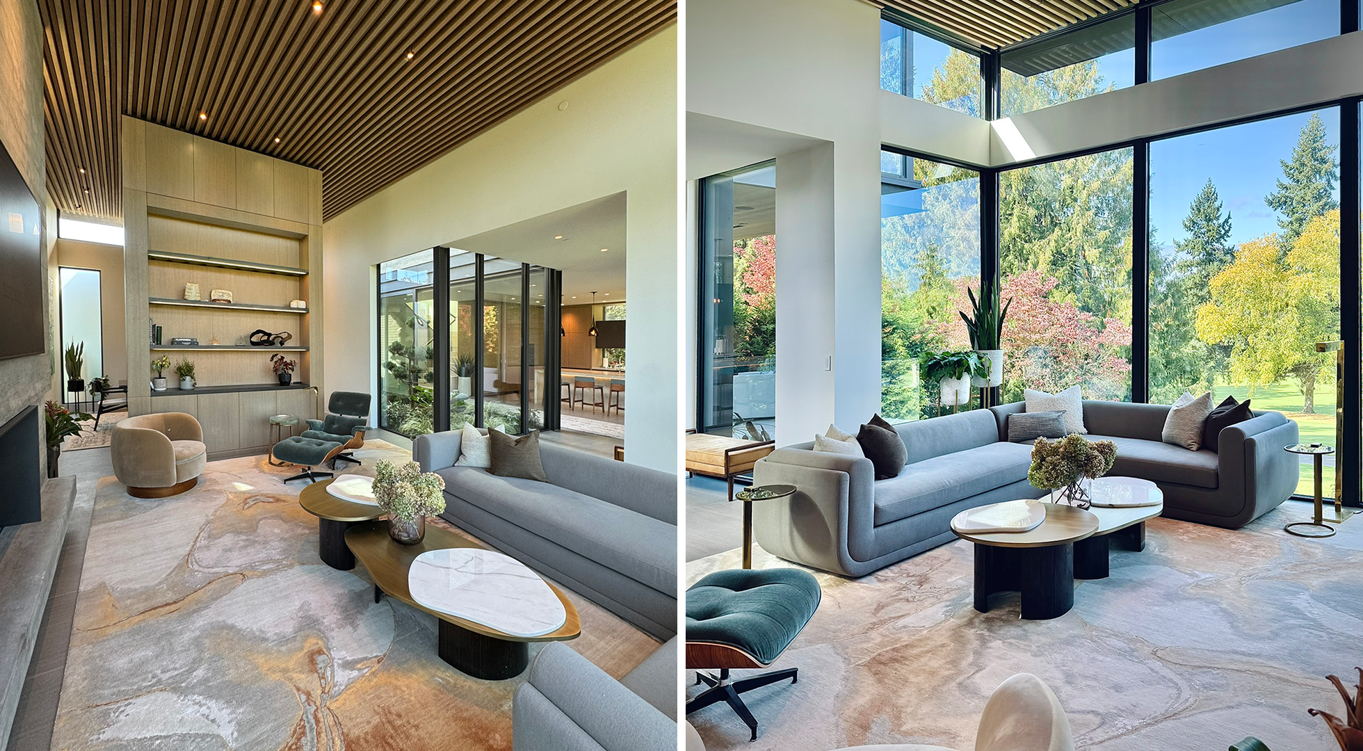
Calming palettes in residential interiors tend to share a few characteristics. They favor tonal variation over high contrast, moving through a narrow range of related values rather than jumping between darks and lights. They draw from the earth, from stone, wood, clay, and sky, which gives them an organic coherence that the eye accepts without effort. And they leave room for the materials in the space to contribute their own color. A honed limestone floor, a walnut vanity, or a hand-troweled plaster wall each carry color that becomes part of the palette. When the paint or stain is selected with these elements already in mind, the room reads as one continuous experience rather than a collection of separate decisions.
This principle is central to understanding how color psychology functions in practice rather than theory. A calming palette is not a preset recipe of specific colors. It is a response to the unique conditions of each room and the life that will unfold within it.
Color Temperature and Lighting
No discussion of color psychology in home interior design is complete without addressing light, because light is what makes color visible. The same wall painted in a warm gray will appear different under morning sun, overcast afternoon sky, and tungsten evening light. Color temperature and lighting are inseparable variables that must be resolved together during the design process, not sequentially.
Daylight shifts in color temperature throughout the day, from cool blue-white in the morning to warm amber at sunset. A home oriented to take advantage of these shifts can use color to amplify the natural rhythm. A kitchen that catches eastern morning light may benefit from a clean, neutral palette that feels crisp and alert at sunrise without becoming harsh. A living room that faces west can absorb warmer tones that deepen as the afternoon progresses, creating a natural transition toward rest.
Artificial lighting adds another layer. The color rendering index and Kelvin temperature of each fixture influence how paint, fabric, and stone read after dark. A warm pendant at 2700K will make a cool gray wall feel softer and more inviting, while a cooler 4000K recessed light may push that same gray toward a clinical tone. In a holistic design approach where architecture and interiors are developed together, lighting layouts and color selections are coordinated from schematic design onward, so the home looks and feels cohesive at every hour.
Natural Hues and Biophilia
The growing body of research around biophilic design confirms what centuries of intuition already suggested: humans respond positively to colors found in the natural world. Greens, warm browns, soft blues, stone grays, and the muted golds of dried grass or autumn foliage all carry associations with safety, abundance, and calm. When these natural hues appear in a home’s interior palette, they reinforce the connection between the built environment and the landscape beyond it.
Natural hues and biophilia are especially relevant in regions where the surrounding environment is a defining presence. In the Pacific Northwest, for example, the palette of the land shifts between the deep greens of conifer forests, the silver gray of overcast skies, the warm cedar of native wood, and the dark basalt of coastal rock. A home designed to integrate with this landscape can draw its interior color story directly from these sources, creating a continuity between indoors and out that feels grounded and inevitable. This is the approach behind projects where architecture, interiors, and landscape are designed as one unified vision, and color is part of the thread that stitches them together.
Biophilic color is not limited to green. The warmth of exposed timber, the cool mineral quality of a concrete surface, and the deep tonal range of natural stone all contribute color to a room without a single painted surface. When these materials are selected as part of the color strategy rather than treated as separate finish decisions, the palette gains a richness and depth that painted walls alone rarely achieve.
Accent Colors with Meaning
In a restrained, material-led palette, accent colors carry significant weight. A single deep blue vessel on a limestone shelf, a burnt orange textile across the arm of a neutral sofa, or a hand-woven rug whose ochre and indigo tones anchor an entire room can provide the point of focus that prevents calm from sliding into monotony.
Accent colors with meaning are most effective when they connect to something specific rather than following a formula. A client’s affinity for the deep red-browns of Japanese lacquerware, the weathered teal of a coastal patina, or the saturated plum of a remembered garden can become the seed for an accent strategy that gives the home its personal identity. These decisions often emerge during the discovery phase of the interiors process, when conversations about how a household lives and what they value reveal preferences that no trend report could predict.
The key is restraint. An accent color that appears in three considered moments, a rug, a pendant shade, a piece of art, carries more presence than the same color scattered across a dozen accessories. In high-end residential interiors, where every element is selected for a reason, the restraint of the accent reinforces the emotional impact that color psychology research describes. The eye lands where it is meant to land, and the accent tells the room’s story without competing with the architecture.
Harmonizing Colors with Materials
The final and perhaps most critical dimension of color psychology in interior design is the relationship between color and material. A painted surface, a stained wood, a natural stone, and a dyed textile all carry color differently. Paint sits flat on a plane. Wood absorbs light into its grain and shifts in tone depending on the direction of the cut. Stone contains internal variation that no paint swatch can replicate. Textile moves with the body and catches light at changing angles throughout the day.
Harmonizing colors with materials requires seeing the entire room as a composition, not a series of isolated selections. When a floor stone is chosen for its veining, the wall color must respond to the warmest and coolest tones within that stone. When a wood species is selected for cabinetry, the adjacent paint or plaster should complement the wood’s undertone rather than fighting it. And when a fabric is introduced for upholstery or window treatment, its dye lot and weave texture become part of the color equation alongside everything else in the room.
This is why color decisions in a custom home are best made within the context of physical material samples viewed in the actual light conditions of the space, rather than from digital images or isolated swatches. The interiors process that leads to cohesive, enduring environments includes discovery tours, materials development, and side-by-side comparison of finishes under the light that will define the room for years to come.
Color as Architecture, Not Decoration
When color psychology in interior design is treated as an architectural decision rather than a decorative one, the results are different in kind. Color becomes part of the spatial sequence, shifting in warmth as one moves from a bright entry into a quieter hallway, deepening as a ceiling lowers over a reading nook, lightening as a room opens toward a view. These shifts are not about individual paint choices. They are about the orchestration of light, material, and hue across the entire home, so the experience of moving through the residence feels calm, rhythmic, and resolved.
This level of integration requires a process where color is considered from the earliest design phases, not introduced after the architecture is complete. When interiors and architecture are developed in tandem, ceiling heights can be tuned to amplify or absorb color intensity, window placements can frame the daylight that will reveal a wall’s true tone, and material selections can build a palette that holds together from threshold to garden and back again.
Start with a conversation about how you want your home to feel
Every home begins with listening. If you are planning a residence where architecture, interiors, and landscape are shaped as one vision, and where color is part of the experience from the start, tell us about your project and we can outline the first steps together.


